15. February 2016
// Articles & Reports

Orange is the best colour – at least, if you believe most of the interior design and colour guides. Orange stimulates the appetite, cheers people up, promotes social behaviour and relaxes. Negative side effects do not exist, unless one simply overindulges from having too big an appetite. Do different colours really have different effects? And if so, can they be made use of in care Environments?
Granted: Phrases such as "Green is the colour of hope" or "Blue gives good dreams" reminds one more of astrology than science. But the effect of colours on the elderly and people suffering from dementia have also been documented. Studies show that the right colours in appropriate places increase the feeling of well-being. Design elements, such as the coloured Softcovers for Stiegelmeyer and Burmeier care beds can also have a positive influence on the psyche of the residents, in addition to the aesthetic effect.
Orange and terracotta bear out their good reputation. Warm colours in the spectrum between yellow and red promote longterm memory and are perceived as pleasant, according to research by the Sozialverband VdK. In many care facilities, they are successfully used as wall colours. But what people feel and what they say are often not the same because the majority answer the question of their favourite colour differently: In a survey conducted by the Allensbach opinion research Institute from 2014, 40% of Germans chose blue while red and green received only 19 and 18 per cent respectively. Friendly yellow, with only 11 per cent, was even behind black. Orange and purple brought up the rear. Blue and other cool colours like green and turquoise are often seen as having relaxing and soothing effects. But with dementia patients, the problem is that these colours are no longer correctly perceived and appear as a faded grey. That is why a strong saturation is recommended.
Even more important than the colour itself can be the way in which it is used. Strong patterns on walls and especially floors can cause confusion for people suffering from dementia. Dark coloured surfaces, shadows and reflections should therefore be avoided on floors – they can be perceived as depths or even water. At the end of a long, painstaking corridor, by contrast, a dark surface makes sense because dark colours reduce areas visually. The authors, Elisabeth Schneider- Grauvogel and Gudrun Kaiser investigate such effects in their guide "Light + Colour – Quality of Living for the Elderly". It is important that those requiring care are not haphazardly flooded with colour.
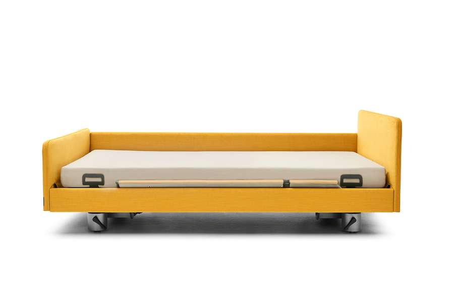
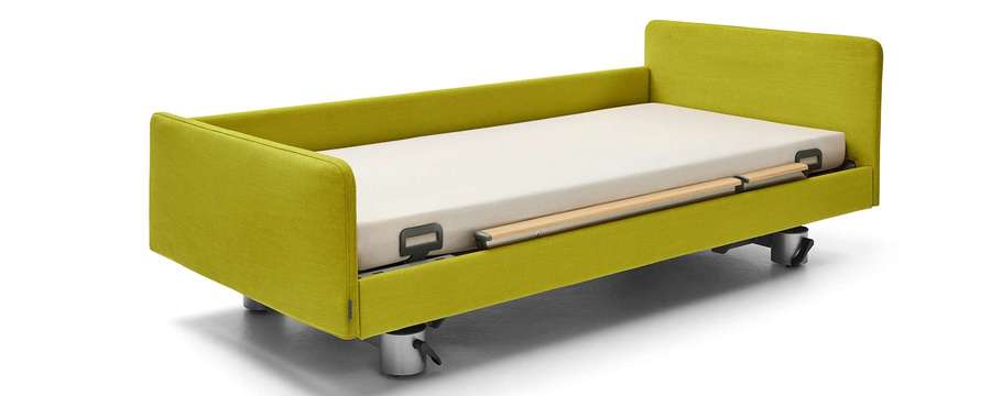
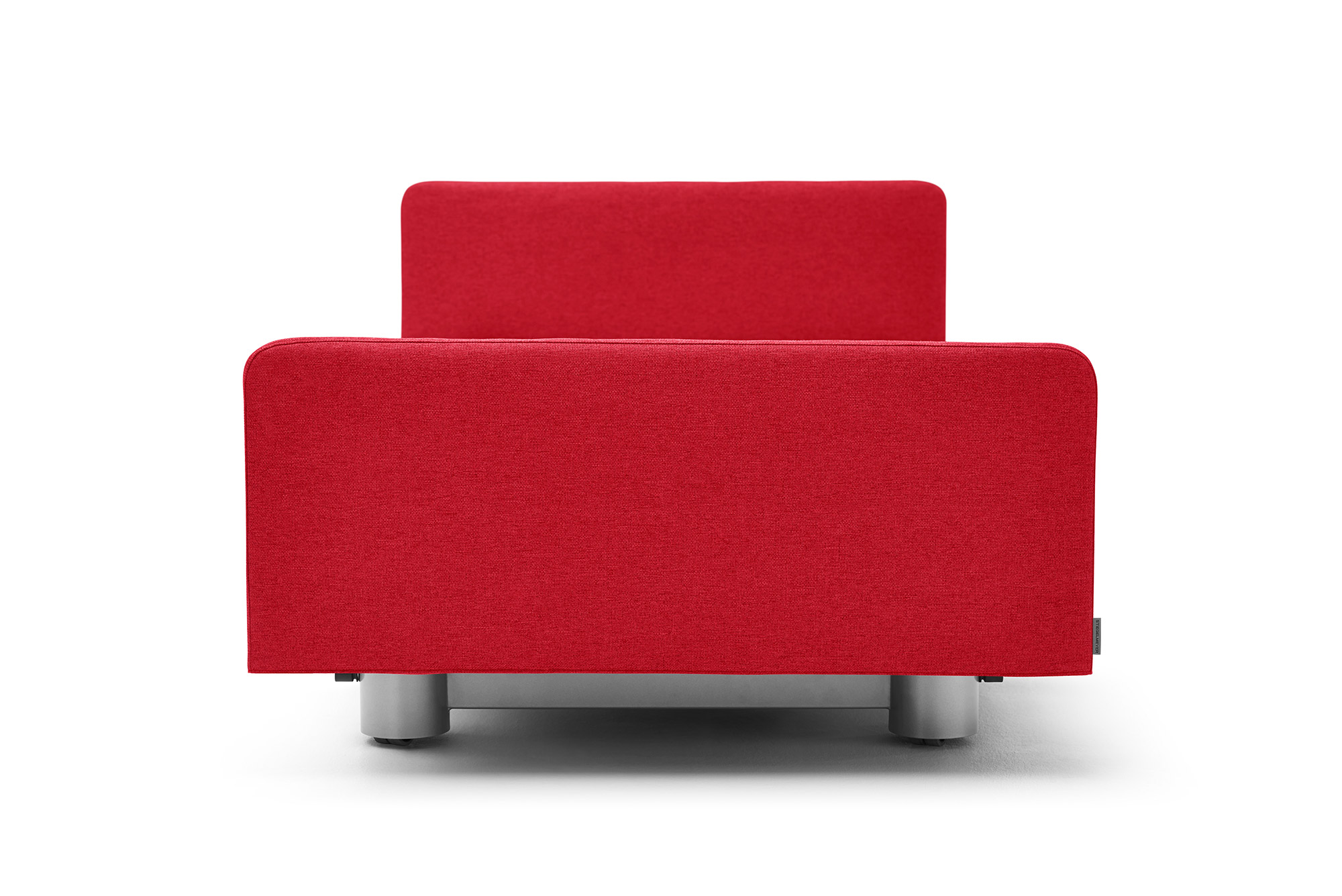
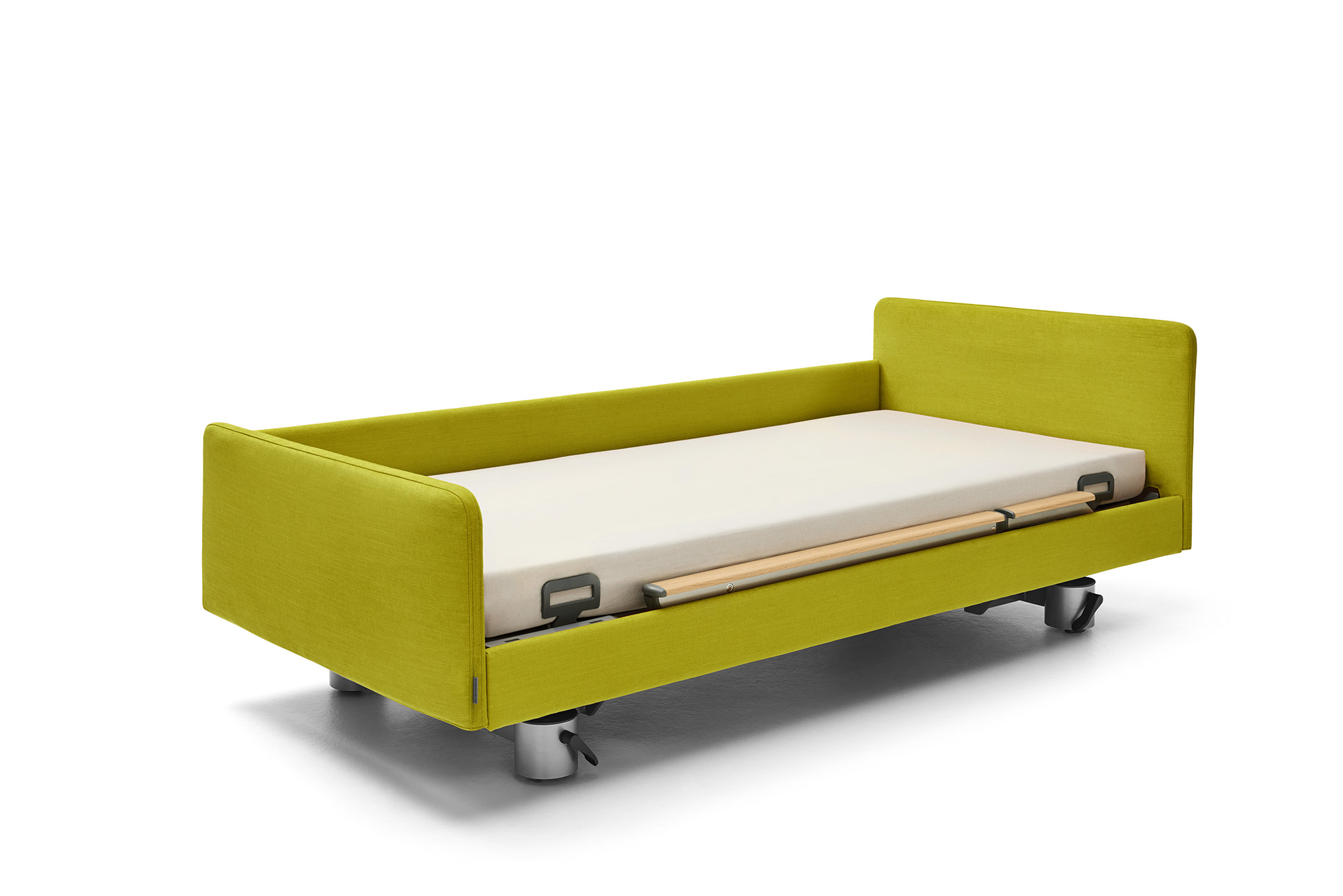
Selected accents against a neutral background can help improve orientation. A brightly coloured bathroom door or a welcoming, invitingly lit stairway can function as a good directional indicator. It makes good sense to also include the care bed in the colour scheme. Because one’s own bed is often a preferred location for many residents, it should give off an atmosphere of warmth and well-being and be easily recognised.
Stiegelmeyer and Burmeier have made new inroads here with their introduction of the Softcovers. Softcovers are textile covers which cover the head and footboards and sides of the bed. They are available for the comfortable Venta care bed used in elderly care residences. In the home care area, a different fabric model can be ordered for the Burmeier beds Dali II 24 Volt, Dali-Wash and Economic II. In both cases, the wide range of colours allows the Softcover to be adapted precisely to the needs and tastes of the resident. If the warming power of the orange family is a favourite, a noble reddish- gold shade is available for the Venta and a cosy terracotta colour for the Burmeier beds. For a calming effect, the radiant saturation of blue and petrol-turquoise can be selected for the DALI II 24 Volt. Green brings the feeling of a bright summer meadow when chosen as the colour for the Venta. And, of course, the Softcover also comes in neutral tones which lend an elegant appearance: delicate brown and lavender-violet, silver grey and light ivory.